The Challenge
The Kansas Turnpike Authority (KTA) manages 236 miles of toll road that run through the state of Kansas. The organization not only manages the collection of tolls; they also maintain and improve the Turnpike for the safety and service of its customers and the economic development of Kansas communities.
Because of the platform’s stability, reliability, and power, KTA has relied on the IBM i system since the 1980s, when it was still called System 38. Over the following decades, they built their business around the platform, including financial and HR software. The cornerstone of their business is the home-grown application, K-TAG. The K-TAG application is vital to the day-to-day business of KTA, and enables the organization to manage all electronic customer interactions. But its legacy green screen interface, dated navigation, and limited user functionality was proving to be a challenge for their newer employees.

Additionally, KTA’s technical team were challenged by the perception of the IBM i as “old” and “outdated” by upper management due to K-TAG’s green screen interfaces.
There’s much more of a learning curve and challenge to using the green screens. Point-and-click interfaces are much more intuitive, and web interfaces give developers more freedom and flexibility with applications than when you’re limited by a fixed layout in a green screen.
Blake Butterworth
Sr. Programmer Analyst, Kansas Turnpike AuthorityThe Solution
Profound UI, a key component of the Profound AppDev suite, is an integrated solution that enables organizations to do everything from web-enable green screens on the fly; to develop brand-new, modern applications; to design and deploy mobile applications. In KTA’s case, they needed a solution that would help them tackle the futurization of a twenty-year-old, home-grown application that had changed many development hands over the years.
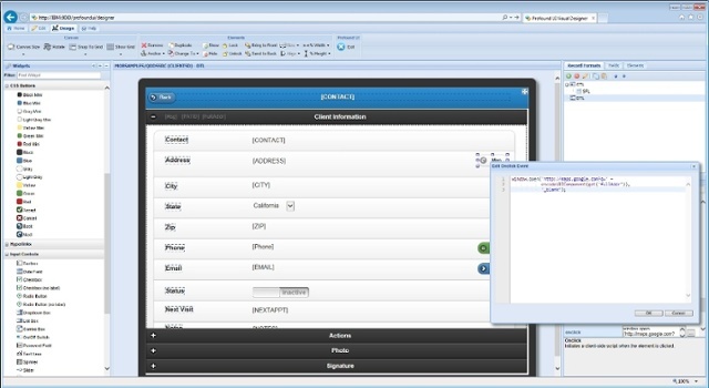
Travis Riggins was brought in by KTA to head the development effort, and right away saw the benefits of working with Profound UI from the Profound AppDev suite. “Once we looked at the original application code, we realized that a re-write would be necessary to make the applications display properly in a Rich display,” states Riggins. “Profound UI was the first product I’ve ever seen that does not slow down the development effort at all. We could develop a rich interface with so much more functionality than a green screen, in the same amount of time. The Rich UI drag and drop Visual Designer is very elegant.”
Before starting any futurization project, it’s very important to have a clear vision of the end-product. KTA agreed that the K-TAG transformation would be best accomplished in a phased rollout approach, which meant futurizing one part of K-TAG to start: in this case, the Accounting component.
Riggins began working with the Profound UI JumpStart code generator module to get the ball rolling. In less than a month, Riggins’ futurization efforts were well underway, including a complete redesign of the application interface in order to streamline and refine how users would interact with the application.
“I brought the users in first thing to help drive the project, and once they could see what we were capable of creating within Profound UI, they begin to ask for things that were never before possible with green screens,” he stated. “Ongoing feedback from the users helped the KTA team complete the application futurization effort in record time, and they appreciated how easily they could easily make changes and roll out updates.”
The KTA team also took advantage of another key component of the Profound AppDev suite: Atrium. Atrium enables companies to transform their outdated green screen navigation with a secure, role-based user portal. “With Atrium, we can connect our users to the information that’s important to them within the application, which makes them even more efficient,” explains Riggins.
The Results
The amount of time it would take to complete a futurization project of this scale was always top of mind for the KTA team, especially since the application interfaces were being re-designed for the Web instead of simply screen-scraped. Profound UI’s native approach to GUI development and intuitive features, including the drag-and-drop Visual Designer, gave KTA the edge they needed to roll out new interfaces in only a matter of weeks.
Bringing K-TAG’s end-users into the futurization process was also a key to the success of the project.
“The end user acceptance of our futurized application has been 100%, which is incredibly rare for any transformation project,” said Meisch. “Our users were able to start using the new Web interfaces right way, because of the point-and-click format with which they’re already familiar. And they are able to work much more efficiently with our customers because they have more information at their fingertips.”
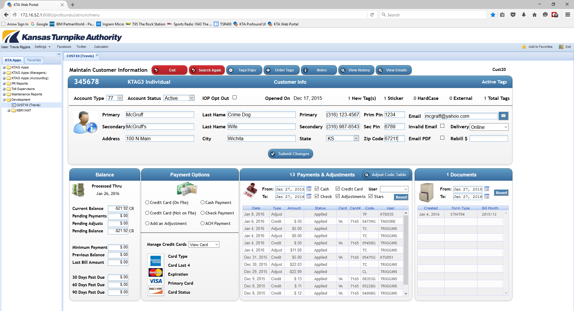
The end users of the futurized K-TAG applications agree.
“Our customer service team is small but mighty,” said K-TAG Customer Service Manager Gary Culbertson. “That is why this evolution to a web-based, user-friendly tool has been extremely important. It allows our staff to be more efficient. It also gives me and some of our executive team access to trends and general program information that helps us make better decisions.”
The modern applications have done more than make their end users happy: they’ve helped secure the future of their enterprise IBM i investment.
“There is the perception that the IBM i is antiquated because of the green screen interface,” states Butterworth. “By moving our interfaces to Profound UI from the Profound AppDev suite, we’re protecting our technology investment while supporting our company’s future success, and proving to upper management that the IBM i is just as modern as any other business platform.”
Riggins sees great benefits from a developer perspective as well. By using modern development best practices, free-format RPG code, and Web 2.0 interfaces, KTA has insured that a new generation of developers will have no problem maintaining their IBM i applications.
“As the aging RPG development population retires, businesses are going to struggle to find younger developers who are comfortable with supporting green applications. With Profound UI’s rich Web interfaces, we know that our developers will be able to maintain and improve upon our applications far into the future.”
The Challenge
The Kansas Turnpike Authority (KTA) manages 236 miles of toll road that run through the state of Kansas. The organization not only manages the collection of tolls; they also maintain and improve the Turnpike for the safety and service of its customers and the economic development of Kansas communities.
Because of the platform’s stability, reliability, and power, KTA has relied on the IBM i system since the 1980s, when it was still called System 38. Over the following decades, they built their business around the platform, including financial and HR software. The cornerstone of their business is the home-grown application, K-TAG. The K-TAG application is vital to the day-to-day business of KTA, and enables the organization to manage all electronic customer interactions. But its legacy green screen interface, dated navigation, and limited user functionality was proving to be a challenge for their newer employees.
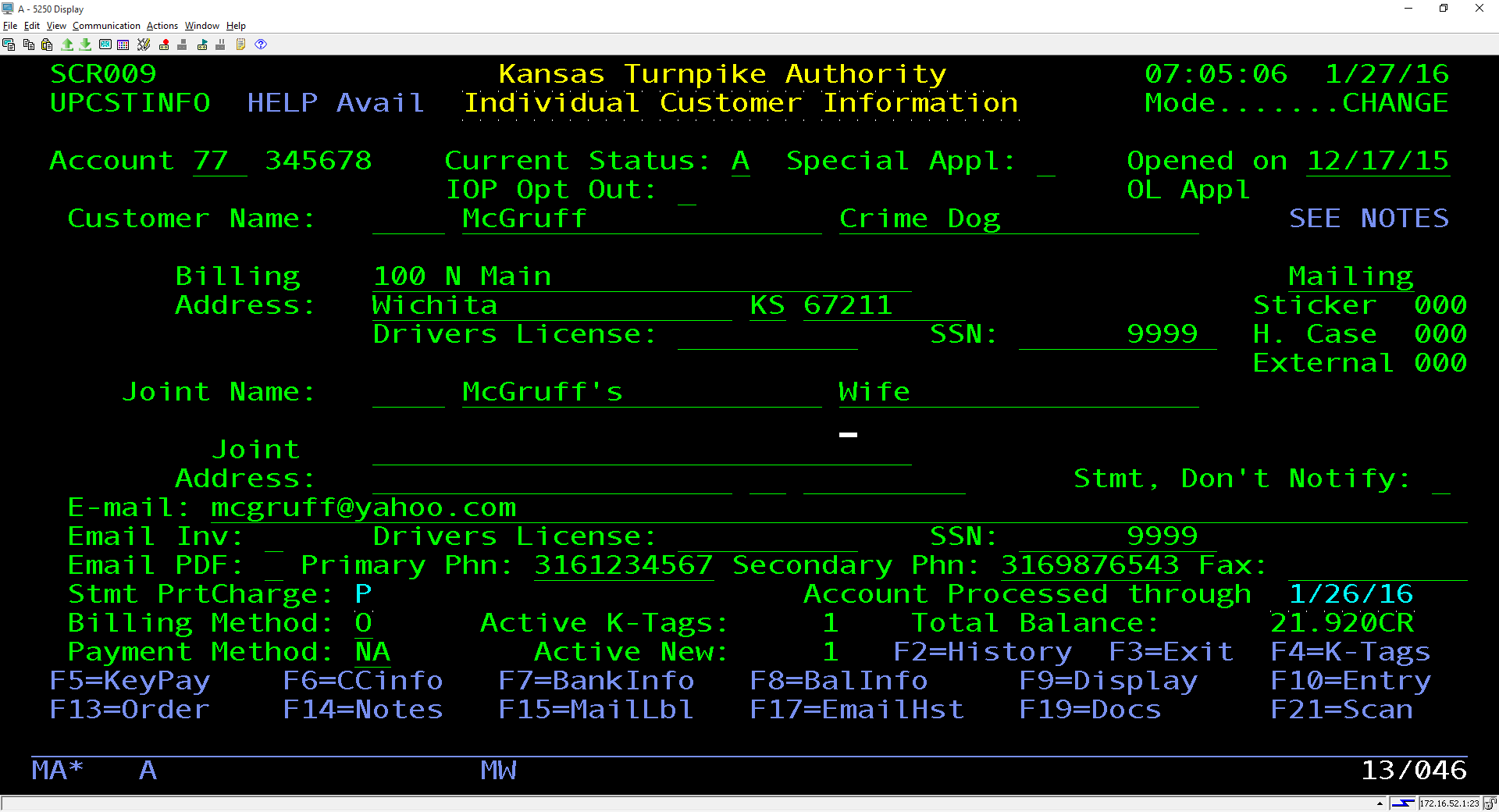
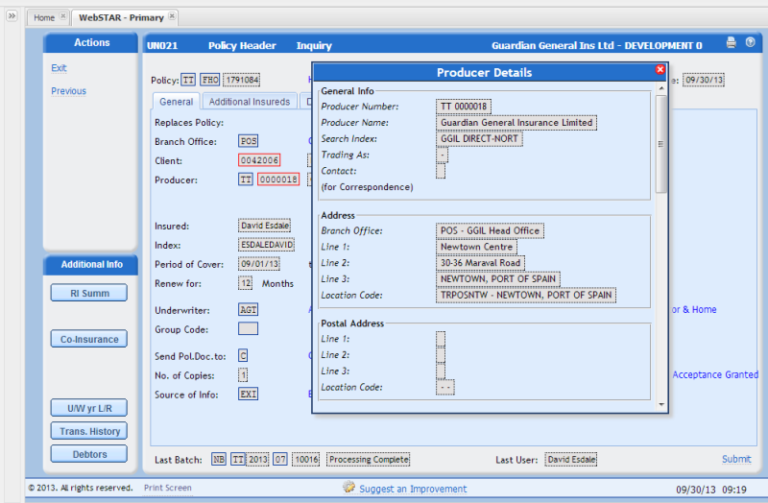
Before: KTA relied on green screen interfaces for their K-TAG application
“There’s much more of a learning curve and challenge to using the green screens,” according to Blake Butterworth, Sr. Programmer Analyst at KTA. “Point-and-click interfaces are much more intuitive, and web interfaces give developers more freedom
and flexibility with applications than when you’re limited by a fixed layout in a green screen.”
Additionally, KTA’s technical team were challenged by the perception of the IBM i as “old” and “outdated” by upper management due to K-TAG’s green screen interfaces.
The Kansas Turnpike Authority (KTA) manages 236 miles of toll road that run through the state of Kansas. The organization not only manages the collection of tolls; they also maintain and improve the Turnpike for the safety and service of its customers and the economic development of Kansas communities.
Because of the platform’s stability, reliability, and power, KTA has relied on the IBM i system since the 1980s, when it was still called System 38. Over the following decades, they built their business around the platform, including financial and HR software. The cornerstone of their business is the home-grown application, K-TAG. The K-TAG application is vital to the day-to-day business of KTA, and enables the organization to manage all electronic customer interactions. But its legacy green screen interface, dated navigation, and limited user functionality was proving to be a challenge for their newer employees.
“There’s much more of a learning curve and challenge to using the green screens. Point-and-click interfaces are much more intuitive, and web interfaces give developers more freedom and flexibility with applications than when you’re limited by a fixed layout in a green screen.”
Blake Butterworth
Sr. Programmer Analyst, Kansas Turnpike Authority
The Solution
Profound UI is an integrated suite of IBM i modernization solutions that enable organizations to do everything from web-enable green screens on the fly; to develop brand-new, modern applications; to design and deploy mobile applications. In KTA’s case, they needed a solution that would help them tackle the modernization of a twenty-year-old, home-grown application that had changed many development hands over the years.
Travis Riggins was brought in by KTA to head the development effort, and right away saw the benefits of working with the Profound UI suite. “Once we looked at the original application code, we realized that a re-write would be necessary to make the applications display properly in a Rich display,” states Riggins. “Profound UI was the first product I’ve ever seen that does not slow down the development effort at all. We could develop a rich interface with so much more functionality than a green screen, in the same amount of time. The Rich UI drag and drop Visual Designer is very elegant.”
Before starting any modernization project, it’s very important to have a clear vision of the end-product. KTA agreed that the K-TAG modernization would be best accomplished in a phased rollout approach, which meant modernizing one part of K-TAG to start: in this case, the Accounting component.
Riggins began working with the Profound UI JumpStart code generator module to get the ball rolling. In less than a month, Riggins’ modernization efforts were well underway, including a complete redesign of the application interface in order to streamline and refine how users would interact with the application.
“I brought the users in first thing to help drive the project, and once they could see what we were capable of creating within Profound UI, they begin to ask for things that were never before possible with green screens,” he stated. “Ongoing feedback from the users helped the KTA team complete the application modernization effort in record time, and they appreciated how easily they could easily make changes and roll out updates.”
The KTA team also took advantage of a key Profound UI module: Atrium. Atrium enables companies to transform their outdated green screen navigation with a secure, role-based user portal. “With Atrium, we can connect our users to the information that’s important to them within the application, which makes them even more efficient,” explains Riggins.
The Results
The amount of time it would take to complete a modernization project of this scale was always top of mind for the KTA team, especially since the application interfaces were being re-designed for the Web instead of simply screen-scraped. Profound UI’s native approach to GUI development and intuitive features, including the drag-and-drop Visual Designer, gave KTA the edge they needed to roll out new interfaces in only a matter of weeks.
Bringing K-TAG’s end-users into the modernization process was also a key to the success of the modernization project.
“The end user acceptance of our modernized application has been 100%, which is incredibly rare for any modernization project,” said Meisch. “Our users were able to start using the new Web interfaces right way, because of the point-and-click format with which they’re already familiar. And they are able to work much more efficiently with our customers because they have more information at their fingertips.”

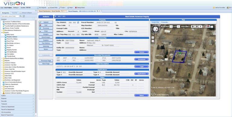
After: The modernized K-TAG graphical user interface, created with Profound UI
The end users of the modernized K-TAG applications agree.
“Our customer service team is small but mighty,” said K-TAG Customer Service Manager Gary Culbertson. “That is why this evolution to a web-based, user-friendly tool has been extremely important. It allows our staff to be more efficient. It also gives me and some of our executive team access to trends and general program information that helps us make better decisions.”
The modern applications have done more than make their end users happy: they’ve helped secure the future of their enterprise IBM i investment.
“There is the perception that the IBM i is antiquated because of the green screen interface,” states Butterworth. “By moving our interfaces to Profound UI, we’re protecting our technology investment while supporting our company’s future success, and proving to upper management that the IBM i is just as modern as any other business platform.”
Riggins sees great benefits from a developer perspective as well. By using modern development best practices, free-format RPG code, and Web 2.0 interfaces, KTA has insured that a new generation of developers will have no problem maintaining their IBM i applications.
“As the aging RPG development population retires, businesses are going to struggle to find younger developers who are comfortable with supporting green applications. With Profound UI’s rich Web interfaces, we know that our developers will be able to maintain and improve upon our applications far into the future.”


